CSS column-gap Property
CSS column-gap property is used to manage the size of the gap or gutter between the columns of an element. As a part of the multi-column layout, the definition of the column gap has now been broadened to include the multiple layout methods.
Now when it is specified in a box alignment, it can be used in multi-column, grid layouts, and flexible boxes. This property can be specified as normal, length, or percentage.
Syntax for column-gap Property
Following is the syntax for the column-gap property.
column-gap: length|normal|initial|inherit;
Example: CSS column-gap Property
Here in the example below, we are using the column-gap property with different border colours, border styles and their different values. In this case, we have given the column-gap of the text as flex and auto. Hence, this breaks the text into three columns.
<!DOCTYPE html>
<html>
<head>
	<title>The column-gap property in CSS</title>
	<style type="text/css">
		#flexbox {
		  display: flex;
		  height: 100px;
		  column-gap: 20px;
		}
		#flexbox > div {
		  border: 4px solid deeppink;
		  background-color: skyblue;
		  flex: auto;
		}
	</style>
</head>
<body>
	<div id="flexbox">
		<div></div>
		<div></div>
		<div></div>
	</div>
</body>
</html>
Output:

Example 2: CSS column-gap Property
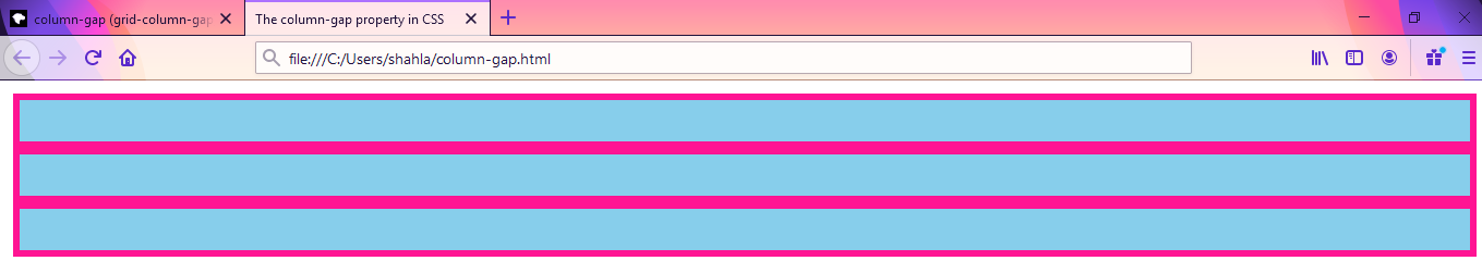
Here in the example below, we are using the column-gap property with different border colours, border styles and their different values. In this case, we have given the column-gap of the text as 'grid'. Hence, this breaks the text into three columns.
<!DOCTYPE html>
<html>
<head>
	<title>The column-gap property in CSS</title>
	<style type="text/css">
		#flexbox {
		  display: grid;
		  height: 100px;
		  column-gap: 20px;
		}

		#flexbox > div {
		  border: 4px solid deeppink;
		  background-color: skyblue;
		  flex: grid;
		}
	</style>
</head>
<body>
	<div id="flexbox">
		<div></div>
		<div></div>
		<div></div>
	</div>
</body>
</html>
Output:
Live example
Here in this live example, you can easily test the live coding and execute the example using different values or edit the coding and create your own example.
Browser Compatibility
There are many browsers that do not support all the latest CSS properties. Hence, while developing any webpage, if you are using any CSS property you must check the browser compatibility for that CSS property and then use it. It is of immense importance today when there is a large variety of web browsers available.
| Name of Browser |
Background size |
contain and cover |
| Chrome |
84 |
84 |
| Edge |
84 |
84 |
| Firefox |
63 |
63 |
| Internet Explorer |
no |
no |
| Opera |
70 |
70 |
| Safari |
no |
no |
| Webview Android |
84 |
84 |
| Chrome Android |
84 |
84 |
| Firefox Android |
63 |
63 |
| Opera Android |
no |
no |
| IOS Safari |
no |
no |
| Samsung Internet |
no |
no |
Conclusion:
The initial value for the column-gap property is normal. This property is applicable to multi-column elements, grid containers, and flex containers. It is not an inherited property. Percentage values refer to the corresponding dimensions of the content area. The computed value for this property is the as specified one and with length, it is made absolute and normal computes to zero on the multi-column elements.