Word "Orange" gives a first impression that it is a fruit. Which is a very obvious thing. Here in this article Orange is an open source tool which provides machine learning and data visualization capabilities for novice and expert users.

Introduction to Orange
Orange is an open source component-based visual programming software package used for data visualization, machine learning, data mining, and data analysis. Components of Orange are called widgets and they range from simple data visualization, subset selection, and pre-processing, to practical evaluation of learning algorithms and predictive modeling.
In Orange, visual programming is implemented through an interface in which workflows are created by linking predefined or user-designed widgets. While advanced users can use Orange as a Python library for data manipulation and widget alteration.
In short, Orange is an open source data visualization and data analysis tool for data mining through visual programming or Python scripting. The tool has components for almost all well-known machine learning algorithms, add-ons for bioinformatics and text mining as well as features for data analytics also. So, for researchers it is a one stop solution for pre-processing of dataset, visualization of dataset using graphs, all inbuilt machine learning algorithms, test and score feature for measuring accuracy of algorithm on different datasets along with many more fantastic features.
Eye-catching features of Orange
Following are some of the many amazing features of Orange,
1. Open source
The best part of Orange is that it is open source so that you can get its code and can even modify the tool as per your requirement. This tool is undoubtedly a boon for people doing Phd or masters in data science and machine learning. Also, you can get the source code of almost all machine learning algorithms too. So you can modify the algorithm as per your application and then you can add that modified algorithm in Orange and take the results. This is seriously amazing feature of the Orange tool.
2. Visual Programming
This tool is not just meant for computer science professionals but even novice users can use it as it provides visual programming. It is as simple installing a game and then playing it.
There is no need to learn any kind of programming languages like JAVA, C, C++ or Python etc, the only thing which you should know is data mining concepts and you should know that which algorithm should be used in a particular scenario.
It provides drag and drop facilities. It even provides lines for connection. To plot a graph was never such playful as Orange has made it. You will definitely fall in love with this tool when you will experience its flexible and visual environment. It provides dotted lines if connection is not proper. If you are not using proper machine learning algorithm or prediction algorithm then it will not allow you to connect with the data.
In short, visual programming provides interactive data exploration for rapid qualitative analysis with clear visualizations. GUI allows users to focus on exploratory data analysis instead of coding, while smart defaults make prototyping of any data analysis workflow fast and extremely easy.
Just place the widgets on the canvas, connect them, load your datasets and yield the insight.
3. Supports Google sheet
Oftenly in data science tools, one can browse any file from the local hard disk. But with Orange, it is possible to fetch the data from a given URL. It also provides support to fetch the data from Google spreadsheet which is its most eye catching feature. So if your data is not in your local hard drive, no need to worry as Orange provides the facility of fetching the data from Google spreadsheets also.
4. Add-ons are available to extend the functionality
It is possible to extend the functionality of Orange through add-ons which are available online. In fact, Orange never provides the toolbox for crunching bioinformatical data as an integral part of it; rather than it has always been an add-on. The exact process of distribution of add-ons has changed considerably in the last year to streamline the process for add-on authors and to make it more standards compliant. Among other things, this enables system administrators to install add-ons system-wide directly from PyPi using easy_install or pip.
Unfortunately there are some negative side effects of this process, notably the temporary breakage of the add-on management dialog within the Orange Canvas. It is reported that this is now being taken care of and you are encouraged to test the functionality. The process to add any add-ons is as below:
Firstly we open the Orange Tool.

The above picture shows the first screen that appears upon opening the Orange tool. Then we go to Options, and click on Add-ons... option.

You will see a new dialog for Add-ons as shown below.

From the list of available add-ons, tick the one you need and click on OK button to install the add-on.

5. Provides Online Support
Orange provides online as well as offline help for their users. Orange is having large online community support for solving the queries of its users. Orange also provides classroom training for its new users. It provides online tutorial supports. It also provides example as shown below:

Similarly more such example workflows are available on their official website for new users.
6. Create Dataset from any Graph you want
The most wonderful feature of Orange is that you can do reverse process. In general we have seen that we plot a graph from the data the we have, but here the reverse is also possible!
It seems strange but yes it is true that you can paint your graph by using paint data functionality and you will be able to generate the dataset for that graph which you have painted using paint data utility of Orange.
Here as shown in the figure below, you can see that using paint data, with help of brush we have painted the graph which we want. Now based on this graph, Orange tool can be used to provide us the dataset for it as shown in the next figure below. So this is just like a miracle for most of the researchers who are not getting dataset as per their requirement. They can now simply get the dataset as per their requirement with just one click.

Below we have the dataset generated from the graph shown above.

Installation Steps for Orange
To install it you can follow the following simple steps:
Step 1: Download and install Orange
You can download latest version of orange from following link: https://orange.biolab.si/download/
Step 2: Run the installer
Step 3: After installing you will get Orange icon on your desktop and click on it and open the Orange tool.
Step4: You will be prompted with a welcome screen of Orange. Now you are ready to start with your first project.
Working with Data
Orange provides you many options to do almost everything with your dataset. As shown in following figure there are almost 26 options to organize your dataset in any manner as you wish.

Visualizing Data
You can visualize the data in almost about 16 different types of graphs and plots. It is very easy and interesting feature of Orange where you just have to connect the dataset to the graph or plot you want and things are done.

Supervised Data Model
Orange provides almost 12 inbuilt machine learning models using which you can directly train your dataset. Inbuilt model includes most popular machine learning algorithms like KNN, SVM, Navies Bayes, Logistic regression and many more as shown in below figure.

Unsupervised Model
Orange provides inbuilt model for both supervised as well as unsupervised learning methods. It provides direct implementation of algorithms like PCA, K-Means etc. It also provides the access to other models as shown in given figure:

Evaluation of Performance of Models
Orange is not only powerful as an implementation tool but it is also excellent tool for evaluating the performance of different model.
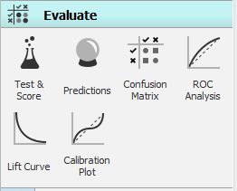
One of the most used widgets in Orange is Test & Score.
The widget mainly accepts 2 inputs - Data and Learner. Data is the dataset that we will be using for modeling for example titanic.tab that is already pre-loaded in the File widget.
Learner is any kind of learning algorithm, for example, it can be Logistic Regression, KNN or it can be SVM. You can only use those learners that support your type of task. If you wish to do classification, you can definitely not use Linear Regression and for regression you cannot use Logistic Regression.
Most other learners support both kind of tasks. You can connect more than single learner to Test & Score.

As you can see in the above diagram we have used to Test & Score from the Evaluate options, connected it to a dataset file and also connected multiple learners to it which are Logistic Regression, Naive bayes and Random Forest.
Test & Score will now use each connected Learner and the Data to develop a predictive model. There are different ways to build models. The most popular process is Cross Validation, which divides the data into n folds and uses n – 1 folds for training and the remaining fold for testing. This procedure is iterative, so that each fold has been used for testing exactly once. Test & Score will then generate report on the average accuracy of the model.
You can also use Random Sampling, which will divide the data into two sets with predefined proportions (e.g. 66% : 34%), build a model on the first set and test it against the second set. This is similar to Cross Validation, except that each data instance can be used more than once for testing.
Leave one out option is again very similar to the above mentioned two methods, but it only takes one data instance for testing each time. If you have a 1000 data instances, then 999 will be used for training and 1 for testing, and the procedure will be repeated a 1000 times until every data instance was used once for testing. As you can imagine, this is a very time-intensive procedure and it is recommended for smaller data sets only.
Test on train data option uses the whole data set for training and again the same data for testing. Because of over fitting, this will usually miscalculate the performance. Test on test data will not work with only existing dataset but it requires an additional data input (Test Data) and allows the user to control both data sets (training and testing) used for evaluation.
There is one more option which Orange provides is the use Cross Validation by feature. Sometimes, you would have pre-defined folds for a procedure that you wish to replicate. For such a requirement you can use Cross validation by feature to make sure that data instances are split into the same folds every time. Just make sure the feature you are using for defining folds is a categorical variable and located in meta attributes.
Additional scenarios are when you have several examples from the same object, for example several features of the same traveller in titanic or several images of the same plant. Then you absolutely want to make sure that all data instances for a particular object are in the same fold. Otherwise, your model may probably report ruthlessly over fitted scores.
In the screenshot below, you can see the various options availaible which we just discussed, you can choose anyone based on your requirements.

Based upon the selection, in the right pane you can see the results.
Thus it becomes very easy for the user to use test and score feature for evaluating more than one model simultaneously.
You may also like: